16
More About Noise
Posted by jns on October 16, 2008In my post about noise yesterday [at my personal blog] I added a rather inscrutable footnote about noise and power spectra. Thoughtfully, Mel asked:
I don’t quite understand this, though: “Pink noise” has a power spectrum that rolls off as the inverse of the frequency. Could you explain what that would look like, for really elementary level brains like mine?
This is just one reason why I love my Canadian friends.
Let’s look at a couple of graphs. It doesn’t even matter that we can’t read the numbers or anything written on the graphs. We don’t have to understand them in any detail, although they’re not very complicated. We get most of what we want to understand just from the shapes of the blue parts.
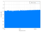
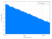
On the left is a power spectrum of white noise (Wikipedia source); on the right is a power spectrum of pink noise (Wikipedia source). Follow the links and click on the little graphs if you want to see the big versions.
The power spectrum graph plots acoustic power (loosely, how loud the component is) on the vertical axis and frequency on the horizontal axis. Frequency increases towards the right, and frequency is just what you expect: high frequencies are high pitches, low frequencies are low pitches.
If you were looking at the power spectrum of a single, pure tone (like the sounds we used to hear in the US for the emergency broadcasting system test signal, but in recent years they’ve switched to something buzzy), you would see one very narrow, tall blue spike located at the frequency of the pitch in question. If you were looking at the power spectrum of a musical instrument you would see a collection of individual, thick spikes at different frequencies that are part of that instrument’s overtone series and identify its characteristic sound.
But these are power spectra of noise, so they have components at all frequencies, which is why the graphs show solid blue regions rather than a lot of spikes–that blue region is really a huge number of blue spikes at every frequency on the graph.
It’s the shape of the top of the blue region that we want to focus on. In the spectrum on the left, the top is flat (and level), telling us that the loudness of each frequency component in the noise is equal to the loudness of every other component over the entire range we can measure.* That’s white noise: the power spectrum is flat and every frequency component is present with equal loudness.
With pink noise, there is a shape–a specific shape–to the spectrum, as shown on the right. The top of the blue region slants downward on the right side, meaning that the loudness of any given component of the noise decreases as the frequency increases. That’s all I meant by “rolls off” really, that the curve goes down as the frequency goes up.
With the pink noise, as I said, the shape is specific. The top of the curve slants to the right but it is a flat slope† and, for pink noise, it has a specific slope indicating that the loudness (actually the “power spectral density”, but let’s fudge it a bit and just say “loudness”) is changing exactly as the inverse of the frequency (1/f).
You can guess there’s a lot more mathematics one can delve into, but that’s more than we needed anyway. Once you see the idea of loudness vs. frequency for the graphs (“power spectra”), you can see the difference between white noise (totally flat spectrum) and pink noise (“rolls off as 1/f”).
You can hear the difference, too. Those two Wikipedia pages I linked to above have very short sound samples of synthesized white noise (approximate) and pink noise (approximate). If you listen you will notice that the white noise sounds very hissy (as I said, like TVs did in analog days when stations were off the air)–that’s because of all the relatively loud, high-frequency components. On the other hand, the pink noise sounds kind of like hearing noise under water, because the lower frequencies predominate in pink noise (water tends to filter out high frequency sounds).
———-
*This is where practicalities come into play. Theoretical white noise would have frequency components at every possible frequency, but in practice a sound like that cannot be produced, if for no other reason than that the sound could not have gone on forever, so there are low (very, very, very low) frequency components that could not be present because there wasn’t time. Besides, audio equipment doesn’t recreate all frequencies equally, etc., and that’s why the graph of the white noise on the left isn’t exactly level but tilts up slightly towards the right side. And, of course, the top edge is fuzzy and jaggy because this is noise, and noise is random. If you were watching this on a device that measured power spectra (a spectrum analyzer–nice, but very expensive), you’d see the jagginess dance around randomly but, on average, the top would remain flat and level.
† The graphs have logarithmic vertical and horizontal axes, with power given in decibels. However, I don’t think we need to complicate our understanding with that right now, just so long as we accept that in this kind of graph this particular straight-line slope down to the right represents the mathematical 1/f shape.